Step past the giant door to the British Pavilion at the Venice Biennale and you’ll feel like you’ve mysteriously been shrunk, Alice in Wonderland-style. Scaled up by 150%, this oversized portal gives a clue to the surreal experience that awaits inside.
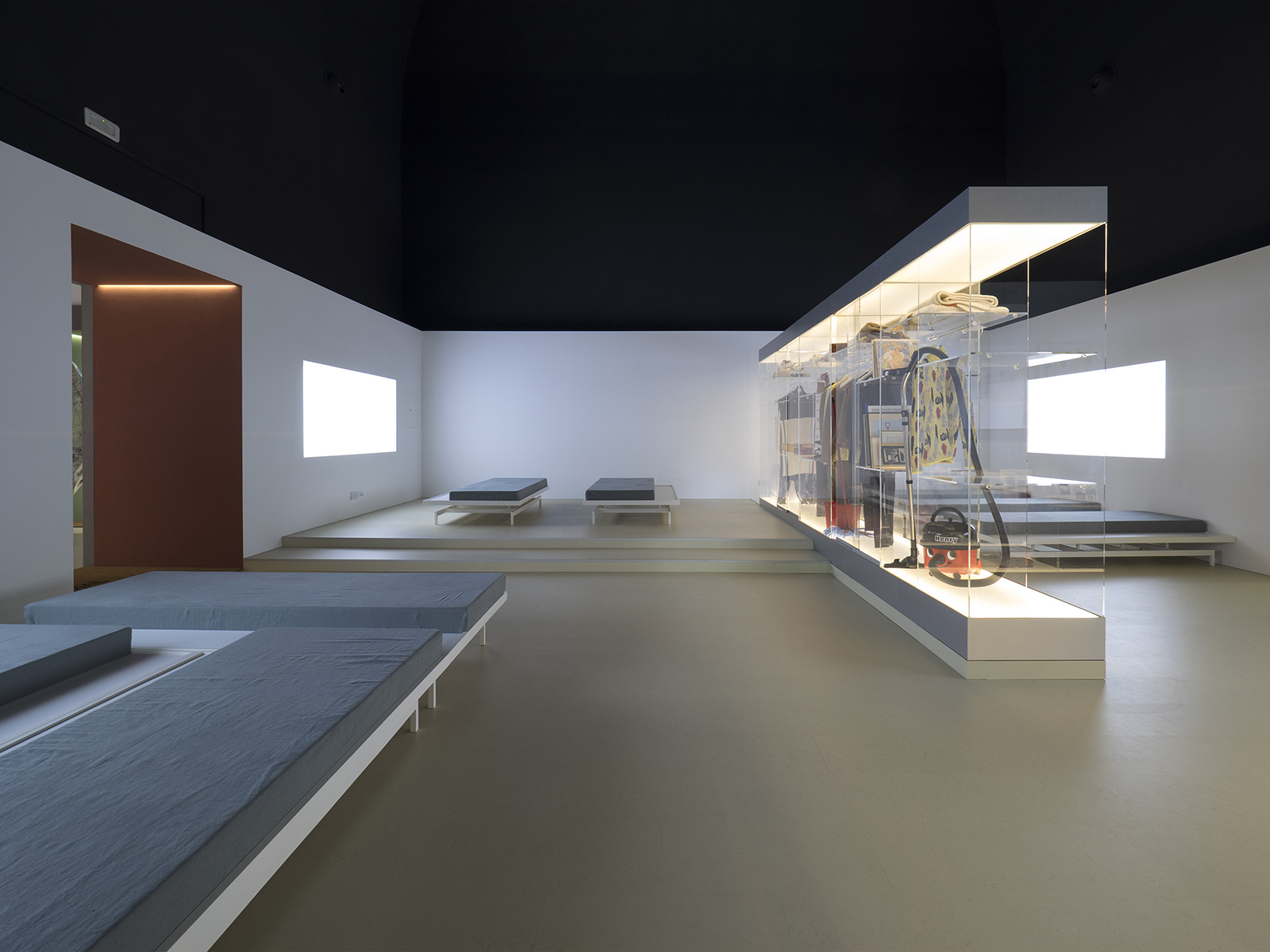
Home Economics – as the exhibition is titled – is conceived as a life-size maquette, ‘almost as if a paper and card study had been blown up to the scale of 1:1,’ say the curators, Shumi Bose, Jack Self and Finn Williams. The entire building becomes the installation.
’We weren’t asked to make a show “about” architecture, it had to actually “be” architecture,’ adds exhibition designer Jesper Henriksson of Hesselbrand.
Photography: Cristiano Corte, courtesy British Council
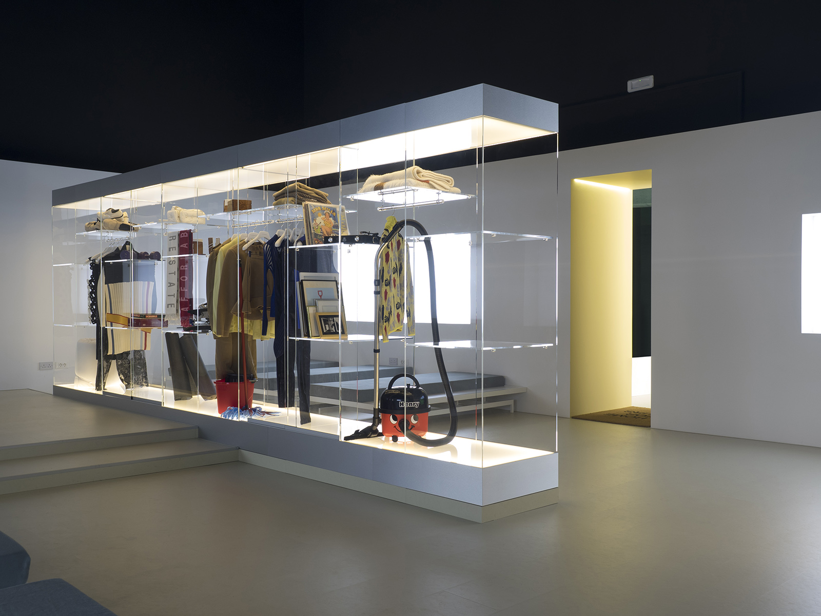
A doormat emblazoned with the words ‘Hours’ and ‘Own nothing, share everything’ welcomes you into the first space – a communal living room, with modular daybeds and a ‘garderobe’ cupboard stocked with power tools and other items to share.
Like this space, each room inside the exhibition – commissioned by the British Council – is a proposal for a different length of occupancy. The curators asked artists, architects and designers to create five new models for domestic life that relate to different periods of time – hours, days, months, years and decades.
‘If you design a space around the length of time you’ll spend in it, it makes you think very differently about the notion of a home,’ says Jack Self.

Photography: Cristiano Corte, courtesy British Council
Their ideas address the rash of over- and under-occupancy that plagues British homes – a typical symptom of a housing crisis. The elderly often live in large homes with empty bedrooms, while the young resort to kipping on sofas in living rooms.
Responding to Venice Biennale curator Alejandro Aravena’s theme of ‘Reporting from the front,’ the curators declare that the ‘front line of British architecture’ is the home.
‘New technologies have displaced how, where and when we work and play,’ they say in their introduction to the accompanying book. Each model in Home Economics addresses ‘different facets of how we live today – from whether we can prevent property speculation, to whether sharing can be a form of luxury rather than a compromise.’
Photography: Cristiano Corte, courtesy British Council
In the ‘hours’ room – conceived by the curators themselves – a collection of gender-neutral clothing selected by fashion designer JW Anderson should help the cause.
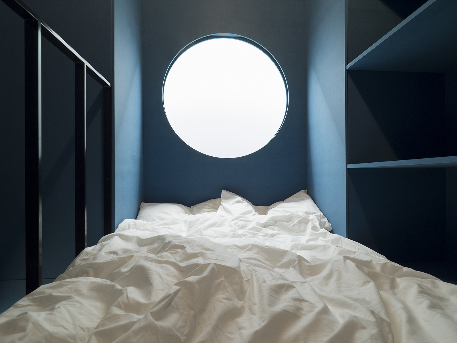
Wander into the ‘days’ section and you can climb into a series of inflatable homes, designed by artists åyr that echo 1960s bubble architecture. ‘This is your portable and personalise space, where you can make yourself at home,’ they declare. ‘To feel at home here you only need a Wi-Fi connection.’
Meanwhile, Dogma and Black Square’s totem of living quarters for ‘months’ gives the boarding house a new spin. It’s not a hotel, or a rental flat, it’s a well-organised communal house. ‘If you pay one flat fee and don’t have any housework to do, it creates egalitarian relationships with your neighbours,’ Self adds. The co-living movement gets an ideological rethink.
Photography: Cristiano Corte, courtesy British Council
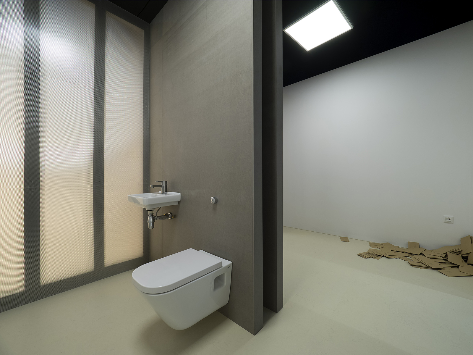
Elsewhere, architect Julia King has created a stripped back space for ‘years’ that tackles the concept of property speculation by offering buyers just a shell, with no fixtures and fittings. And Hesselbrand’s ‘decades’ is a space with no prescribed function, designed to be adapted to the needs of ageing inhabitants.
‘It doesn’t tell you how you should live, it just offers you possibilities,’ says Self.
Throughout the show, there are no architectural drawings or explanations – save for the doormats. It’s an entirely spatial experience, where accessories and furnishings are kept to a minimum.
Photography: Cristiano Corte, courtesy British Council
’We wanted to contrast the experience of buying real estate, where developers add so many lifestyle elements that it’s hard to see what you’re buying,’ Jesper adds. ‘Here, we’re making the visitor more aware of how they can inhabit these rooms.’
At times disorienting and always engaging, it makes you look at space anew. Home Economics doesn’t seek to solve the housing crisis, but it proposes ideas that could have a broad application – far beyond Britain.


