Ordinarily the design of the Frieze London tent goes unnoticed unless something goes wrong – the light too glaring, the entrance too clustered, the heat too high.
This year, however, the Frieze Projects commissions have burrowed thematically and physically into the fair’s temporary architecture. Taking cues from interventions at Frieze New York in May, the artists’ structures occupy gaps in the site, or encourage visitors to re-assess their relationship with the space.
‘We thought it would be interesting to think about the materials that go into the temporary architecture of Frieze and to use that to shift people’s experiences of the site,’ explains curator Nicola Lees. ‘That’s why I wanted to use artists whose work was interdisciplinary, such as ÅYR, who have a background in architecture, or Jeremy Herbert, who also works as a set designer.’
Herbert’s is perhaps the most dramatic intervention.
Concealed in a skulking, battleship-grey box occupying an atrium at the heart of the fair, it is accessed by a half-height door worthy of Alice in Wonderland. A downward ramp leads to a dim space beneath the tent, animated from one side by a silent wind machine of the artist’s own devising. Standing with your feet in the grass and the wind in your hair, gazing out across the scaffolding structure holding the tent aloft, one feels wild and miniaturised, as if taking a cat’s eye view.

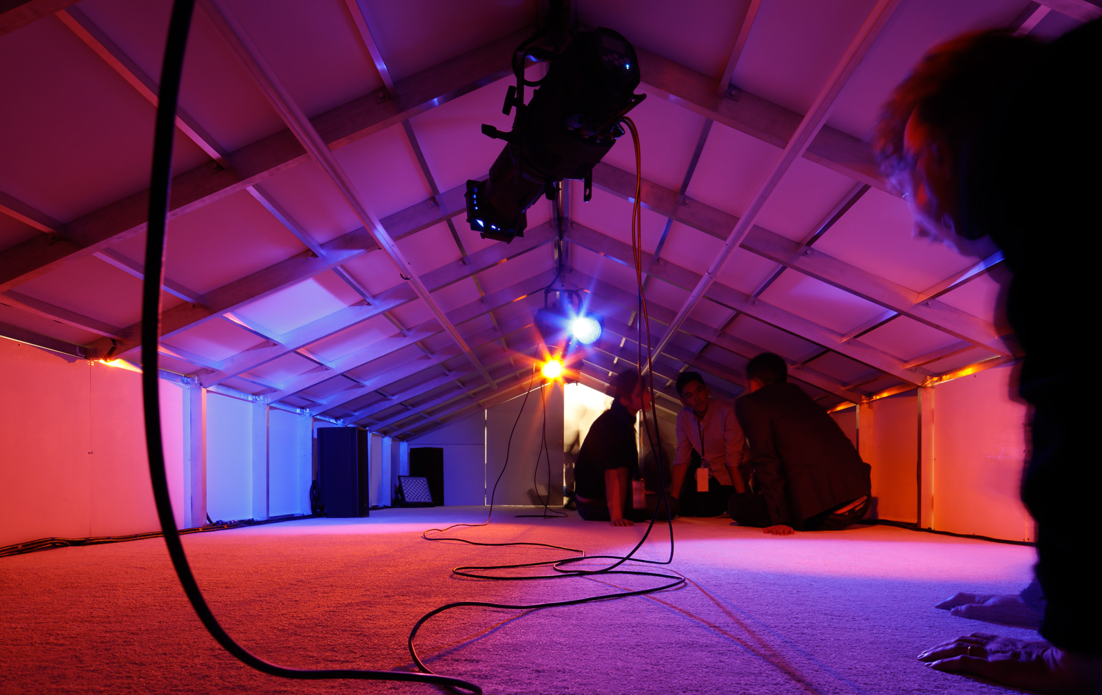
Anthropomorphic experiences are provided too by Rachel Rose, in another installation that will prove demanding for those with creaky joints.
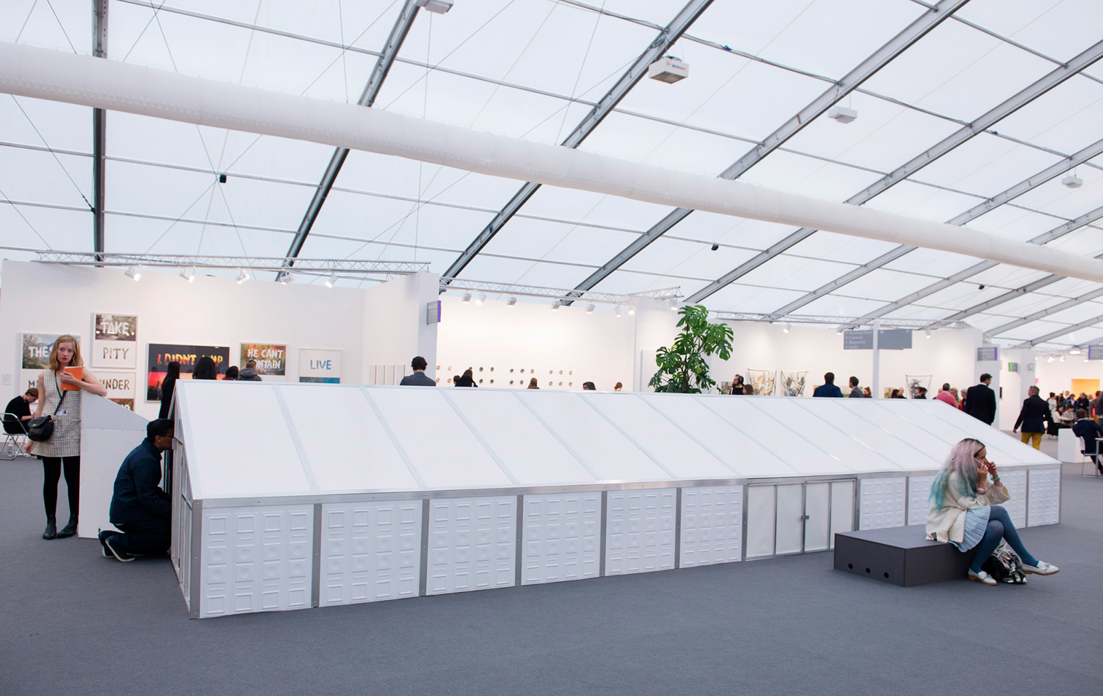
Rose presents a mini version of the tent itself, so small that the carpeted space must be entered on hands and knees, inside which she has filtered audiovisual elements to reflect the perceptive scope of creatures inhabiting Regent’s Park. Playlists and flickering colours will change in texture day by day to reproduce the experience of a fox, mouse, newt, robin and stickleback, and their more or less alien worldviews.

‘By working with the architectural elements we have been able to have more control over all of the senses,’ explains Lees. ‘Scale has also been important – from Lutz Bacher’s corridor, which is quite monumental, to Rose’s miniature tent.’
Lees and the artists that she commissioned have worked closely with Universal Design Studio to fully incorporate the projects into their design of the tent structure.
The most visible of all the commissions, Bacher’s corridor into the fair is entered via black PVC strip curtains of the kind specified for slaughterhouse use, and clad in dark stage flats bearing foreboding slogans (‘Welcome to Purgatory’) that once formed part of a film set.
Others, such as ÅYR’s Comfort Zone, are intentionally more concealed.
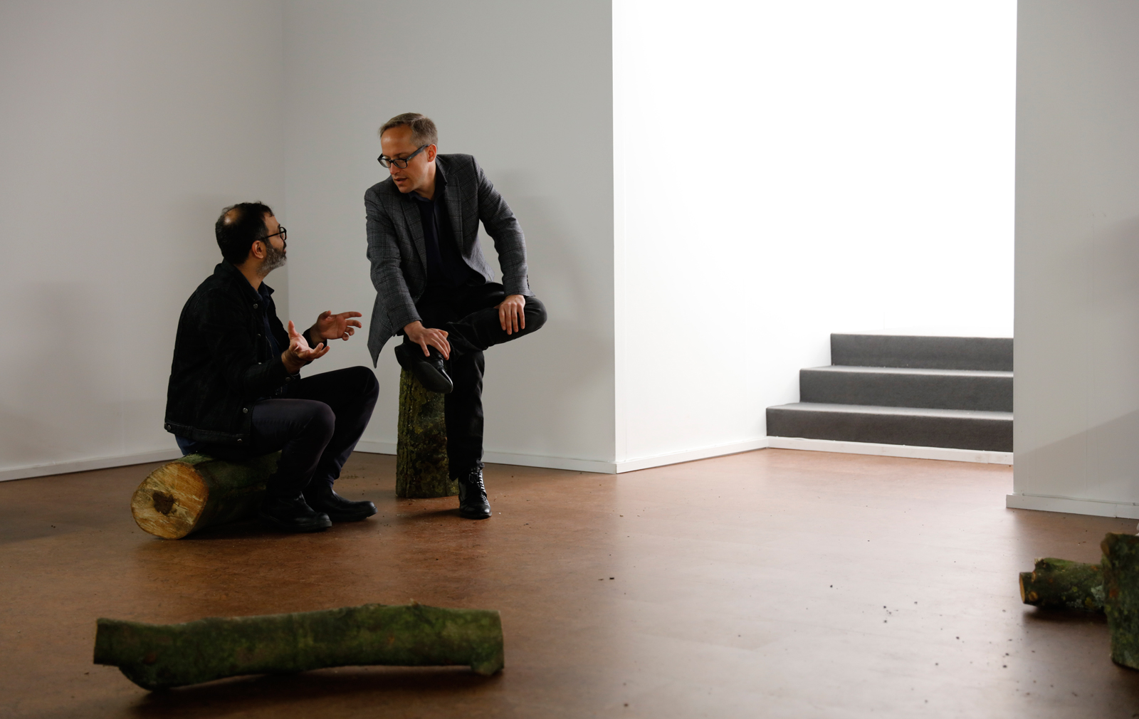
Asad Raza’s chamber, hidden behind a bookshop, takes inspiration from the use of caves and other natural features in the ritual sites of ancient religions.

Occupied by performers and horse chestnut limbs, it evokes the cult and worship of the Greek god Pan, and the understanding of the limits of human mastery over the natural world that he symbolizes. Raza characterizes the cultural identity of the cave as a ‘found place’ of ‘encounter and also shelter’.
It’s a fitting alternative to the rational intentionality of the tent itself.


