Switch House, Tate Modern © Iwan Baan

Switch House, Tate Modern © Iwan Baan

Sheela Gowda, ‘Behold’, 2009 © Sheela Gowda

Switch House, Tate Modern © Iwan Baan

Switch House, Tate Modern © Iwan Baan

Magdalena Abakanowicz, ‘Embryology’,
1978-80 © Magdalena Abakanowicz

Cristina Iglesias, ‘Pavilion Suspended in a Room I’, 2005 © Cristina Iglesias

Switch House, Tate Modern © Iwan Baan

Installation view of Artist Rooms: Louise Bourgeois
Photography courtesy Tate Photography © The Easton Foundation
Tate Modern’s new Switch House is a textbook example of how a gallery can accommodate physical growth as well as fast-changing social, cultural and economic stature.
When the original Tate Modern opened in 2000, it was expected to draw two million visitors a year. That projection was exceeded by three million and by 2005 plans were being drawn up to extend the gallery into a new, purpose built structure above the small park to the south. Herzog & de Meuron, the architects of the original conversion, were commissioned to design the building, with planning secured.
In many respects, Switch House vindicates the Tate Modern’s original decision to retain the Turbine Hall in its entirety – which seemed like a waste of space at the time – by functioning as the hub it has always needed. Thanks to hard-won funds and sheer design determination, the building’s spatial layout has finally been perfected.

Incredibly, the new building increases the area of the institution by 60%, with substantial chunks of that new space given over to public space, education, events and new hanging. As Nicholas Serota said at the opening, this is in effect ‘a new Tate modern with a new configuration, new facilities, new learning spaces and a new view of the world as it has been for the last 120 years or so’.
Photography and film are given new prominence, and the gender imbalances of the past are addressed (just 17% of the art hung in the Tate Modern in 2000 was by women artists – the new galleries are split 50/50).
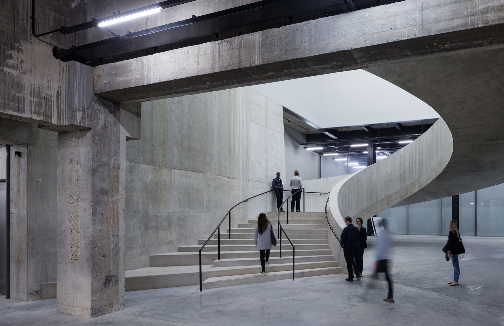
From the gloomy, cavernous concrete framing of the Tate Tanks, which opened as a performance space in 2012, the new galleries are reached by a broad ribbon-like concrete staircase that winds up through the building.

Architecturally, there’s nothing to fault. Herzog & de Meuron are in their element, with concrete poured, shuttered, precast, rough, smooth, pitted, scarred and polished to perfection.
The first stair links the ramp level with the new bar, shop and public plaza at the rear of the building, two huge semi-circles that mirror the forms of the old oil drums that once lay beneath the ground. It’s a much more generous, light-filled ascent than in the original gallery, with broad circulation spaces and tall voids that lay bare the toughness and solidity of the design, perhaps the densest chunk of concrete in contemporary London.
Overall the interiors are far lighter than the heavy brick facade and chunky concrete mullions would suggest.
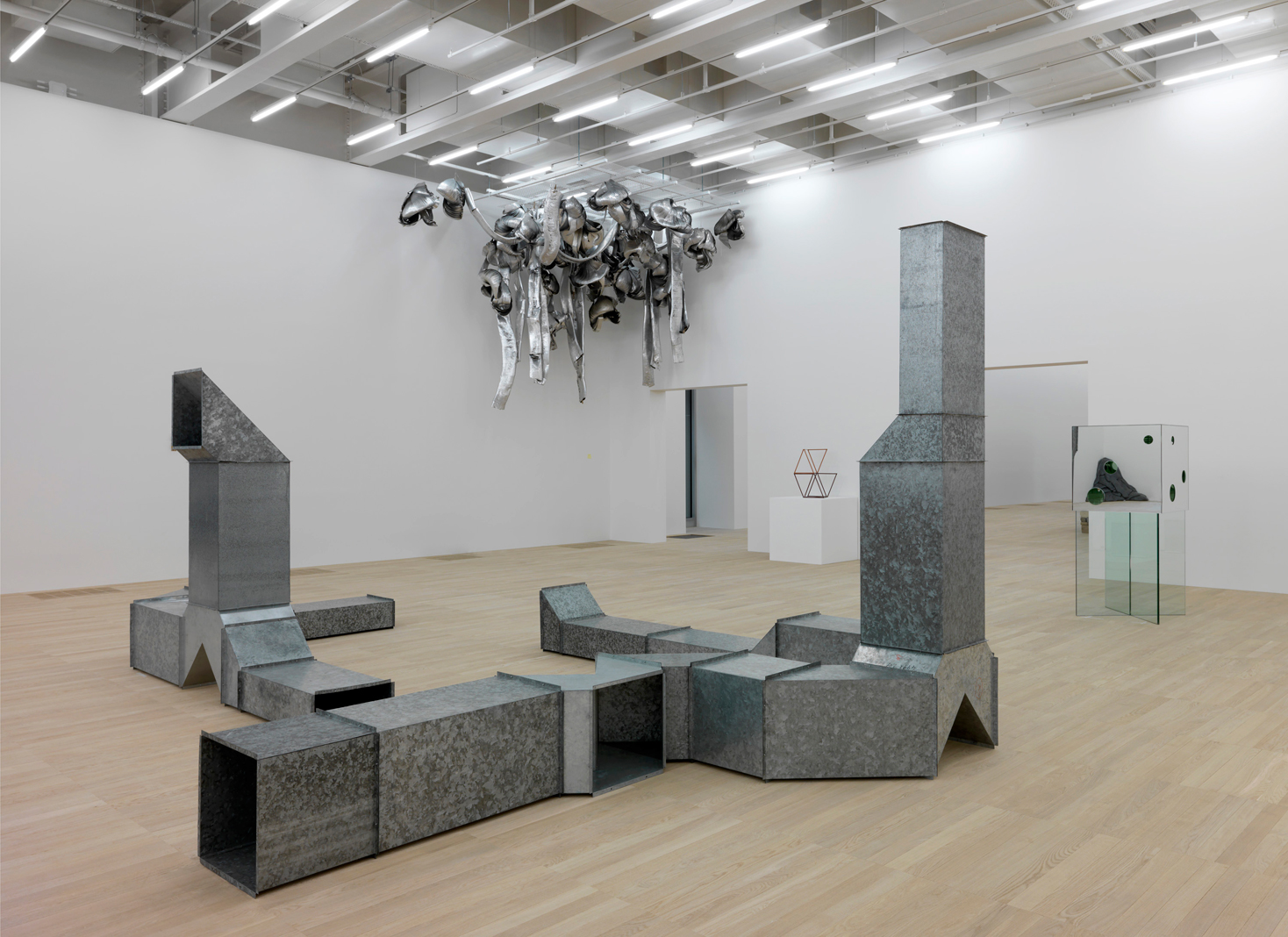
The opening exhibition on Level 2, ‘Between Object and Architecture’, focuses on sculptural installations and has been tailor-made for the new gallery spaces: huge white rectangles with slot windows that are thankfully larger than the originals recycled from Gilbert Scott’s power station.

Level 3 offers up new galleries for displays from Tate’s substantial collection, beginning with ‘Performer and Participant’, a look at performance art, while Level 4’s galleries is showing ‘Living Cities,’ a show about artistic responses to urbanism.
The Switch House is a triumph of fundraising and patronage – the £260m cost was the UK’s largest cultural fundraising campaign – and of the unshakeable belief in culture’s role in place-making, a point echoed by the newly elected London mayor, Sadiq Khan. Khan also reiterated that a culture-centric city is nothing without actual artists living and working in its environs, something that will hopefully be addressed by the spectacular Tate Exchange space on Level 5, launching in September as a shared area for other artistic organisations and educational establishments.
Level 6 is given over to events, Level 7 to staff and Level 8 is a new Members Room, tastefully decked out in oak flooring, furniture and panelling, yet with a high window line that denies a view to all but a few high stools. From here, you get a voyeuristic insight into the neatly ordered lives of NEO Bankside’s residents, watching a Roomba go about its chores in the apartment opposite, for example – an installation worthy of any gallery.

Diners at the new restaurant at Level 9 are also denied a view, but all this is forgiven by the majestic Viewing Gallery and terrace at Level 10, the Tate’s gift to London and one of the best viewpoints in the capital.
Throughout the new building there are thrilling vistas across the city, even as the staircase gets necessarily more intimate as it ascends into the peak of the ziggurat. The new bridge across the Turbine Hall at Level 4 offers up an epic and previously unseen view of the space.
Serota has always acknowledged the Tate’s complicity in art’s relentless ascendancy to economic powerhouse. ‘This is a building that’s not just about art, it’s about London, it’s about the city and the community,’ he says, while Lord Browne, the Tate’s Chair, makes explicit the shift from industry to culture, describing the gallery as ‘a building that was once London’s beating heart [that] is now its cultural cathedral’.
There are many benefits here. For a start, the Switch House reclaims the upper echelons of London’s skyline from the self-described elites, but it also opens up an institution that had become a victim of its own success. ‘We didn’t set out to build an iconic building,’ Serota says rather disingenuously, but it’s hard for H & de M to do anything less. As decade-long investments go, the Switch House is a winner, one that will pay back many times over in cultural capital, artistic enjoyment and the sheer joy of a new window onto a fast-changing city.
Read next: See what the new Museum of London at Smithfield market might look like


