

When the Cape Town outpost of advertising giant Saatchi & Saatchi swallowed up another agency, BrandsRock, the company faced a conundrum: how to integrate a whole new group of people – with their own ethos and set of work habits – into one office?
The solution rested in a redesign of its offices in The Foundry building in the city’s Green Point area. Saatchi & Saatchi enlisted Inhouse Brand Architects to reconfigure the space for the new influx while espousing the two companies’ identities.
For Annelise Botes, the lead designer on the project, the key to working the brief was in the ad firm’s branding. ‘The Saatchi & Saatchi logo is the ampersand and we thought it quite apt to use that as our point of departure as it held reference to both the merger of the two companies and the idea to create a communal space for all.’

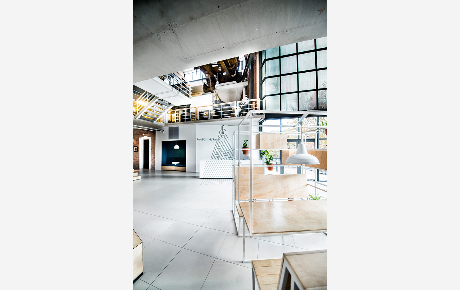
Inhouse Brand Architects opened up the reception area, which welcomes you with a large ampersand graphic, by removing partitions and installing casual meeting booths. These seating areas solved another issue: an awkwardly laid-out corner of the former factory building.
‘This was a problem area as we had a few random I-beam columns in the space,’ said Botes. ‘We ended up incorporating them into a planter wall and booth seat configuration in order to make sense of the space.’
Design features elsewhere tow the creative company line: irregular forms and shapes lend an air of unconventionality while pop culture references add a playful touch.

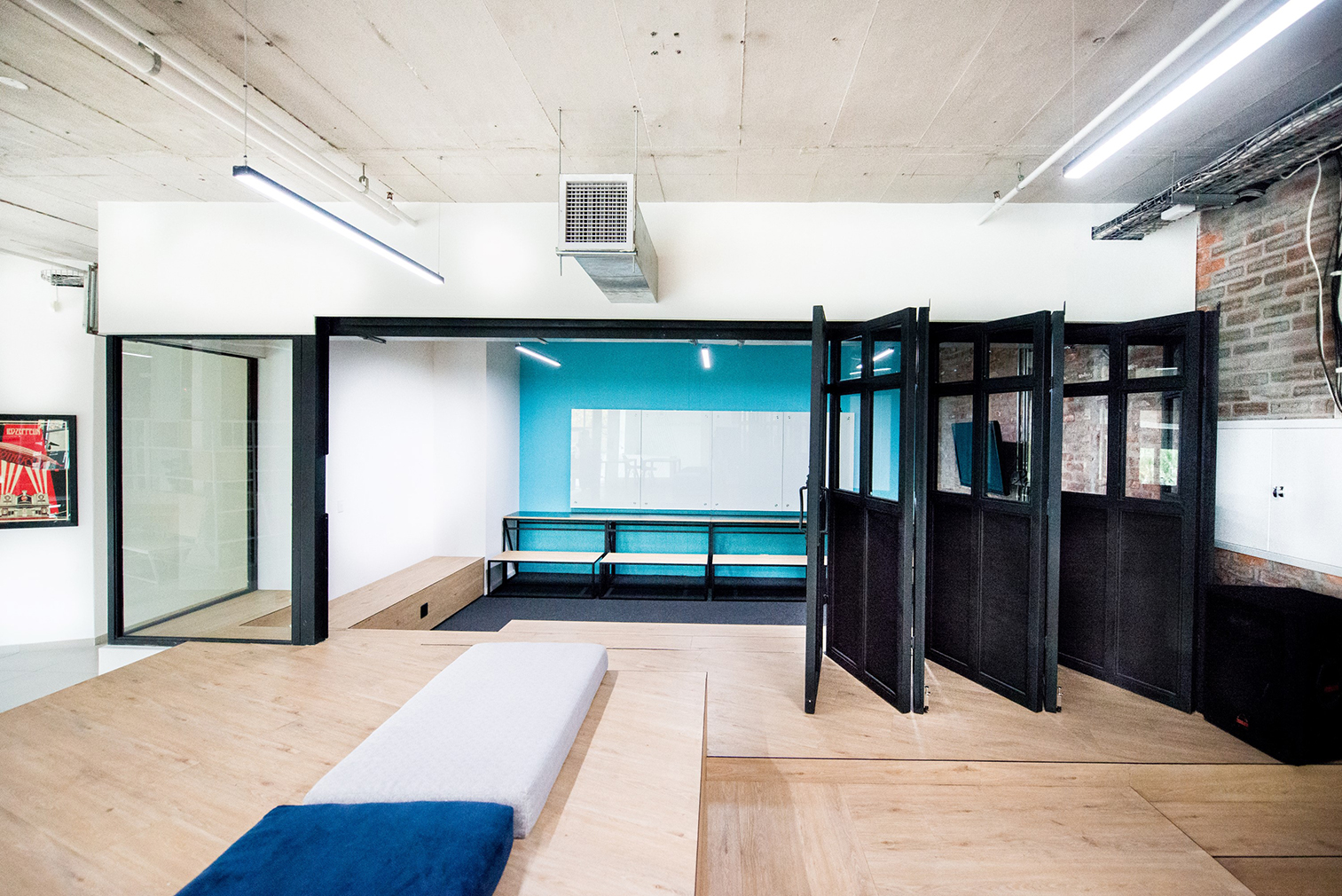
A large meeting room at the end of the office space features folding glass doors, which can open up to the rest of the space when needed. Inhouse Brand Architects also designed bespoke furniture that can be rearranged to become seats, benches or tables.
Exposed brickwork and industrial fittings serve as a reminder of the building’s original use as a factory. Today, though, it’s ideas and campaigns that are made in the space.


