A lot has gone right for Frida Escobedo in her relatively short career as an architect. Add to that her invitation to design the 18th Summer Pavilion at London’s Serpentine Gallery – at 38, she is the youngest to do so and the first female principal since Zaha Hadid began the tradition in 2000.
So the unusually glorious spring weather leading up to the launch will have surprised few: where this Mexican talent carves out space for a project, the sun follows.
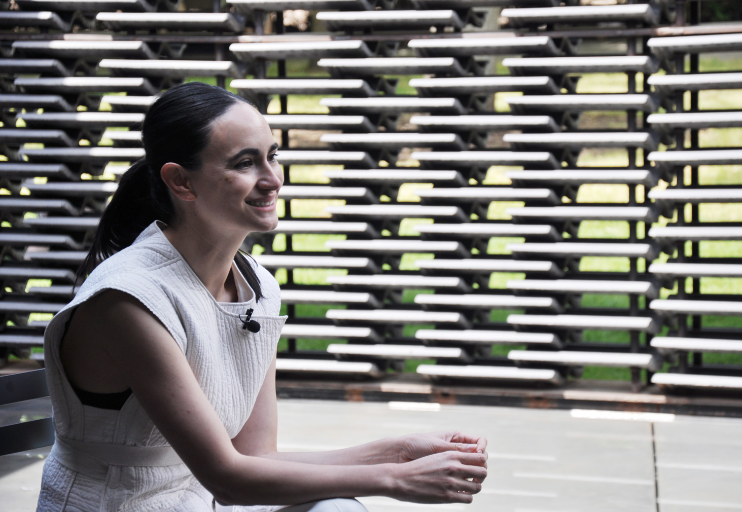
Frida Escobedo is a creator of grand gestures looking for a grand mission. Her guiding light is the Mosque-Cathedral of Córdoba, a layering of Roman, Gothic and Moorish features – she studied its component parts in architecture school and finally saw it in person six years ago.
Yet her projects to date could practically fit in one chapel. The Serpentine Pavilion is a step in the right direction…
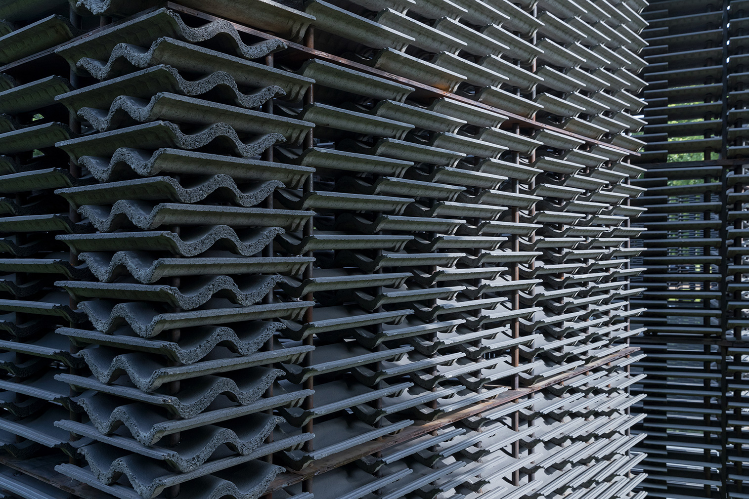
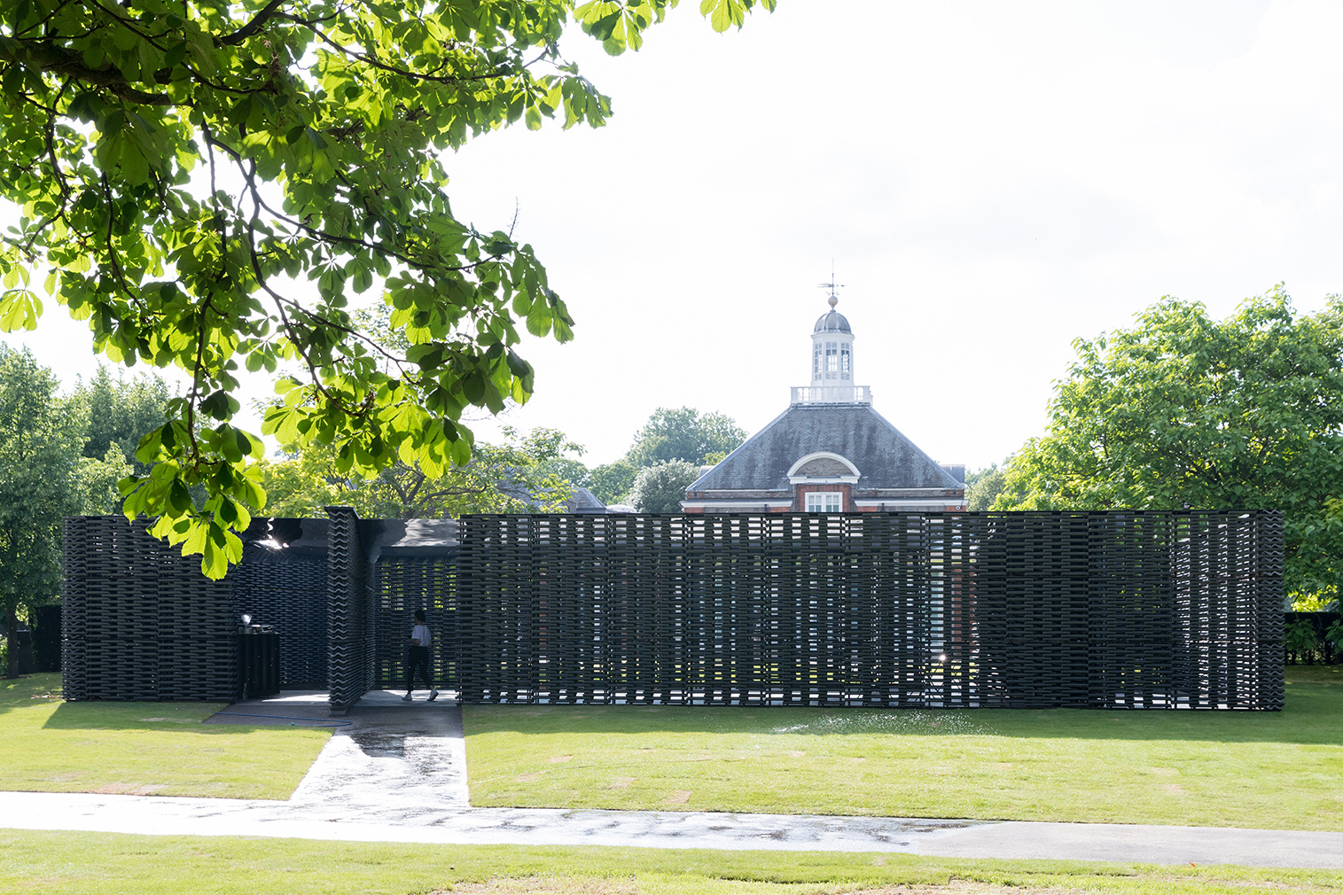
She designed the rectangular volumes with a true melding of cultures in mind, à la Córdoba. The prefabricated modules that form the walls employ British industrial concrete roof tiles arranged in an intricate stacked pattern reminiscent of a celosia, or traditional Mexican breezewall. Blending such cultural sources is the modus operandi of her practice
The exterior walls follow the perimeter of the gallery, whereas the inner courtyard – another Mexican architectural trope – aligns with the Greenwich meridian, 10 miles east. That homage, says Escobedo, resolves the contradictory duality of this temporary pavilion that will, in four months’ time, find a permanent home, somewhere.

Serpentine Pavilion 2018, designed by Frida Escobedo, Serpentine Gallery, London (15 June – 7 October 2018) (c) Frida Escobedo, Taller de Arquitectura. Photography: Iwan Baan

Serpentine Pavilion 2018, designed by Frida Escobedo, Serpentine Gallery, London (15 June – 7 October 2018) (c) Frida Escobedo, Taller de Arquitectura. Photography: Iwan Baan
‘Even if you move the structure, it will always have a context,’ she says. ‘You will always be able to locate yourself, to know where north is. The meridian allowed us to frame the space in a more comprehensive way.’
In this way, the structure acts as a literal and metaphorical compass, not only orienting the public but pointing to northern and southern cultures of influence.
The twists and turns that arise from the pivoting volumes produce a slight labyrinth. Adding dimension to the experience are a shallow, tapered pool, pumped from a reservoir just below ground, ‘like a shoreline’, and a stainless-steel ceiling with a mirrored underside. They reflect each other as well as the activity between them – visual puns referencing the Serpentine’s goal that this be a place for reflection. Escobedo worked such complexities into the design intentionally, to create, she says, ‘moments of surprise. From the exterior, the pavilion seems very straightforward, a plain rectangle, but once you come in, it becomes hard to understand the geometry, how the space flows.’
In the design phase, Escobedo broadened the dimensions of the steel roof for ample coverage. This being London, visitors will, eventually, huddle from the rain, and they’d prefer to do so in a space larger than that of a bus shelter. Yet the initial clear skies helped showcase the building’s best assets. Through the exquisite brickwork, the sunlight streams in, casting shadows that move across the interior with the passing of the day. Besides which, the darkness of the concrete tiles draws the vivid Hyde Park setting to the fore.
‘The natural light blocks out the dark, until you just see the landscape outside,’ she says.
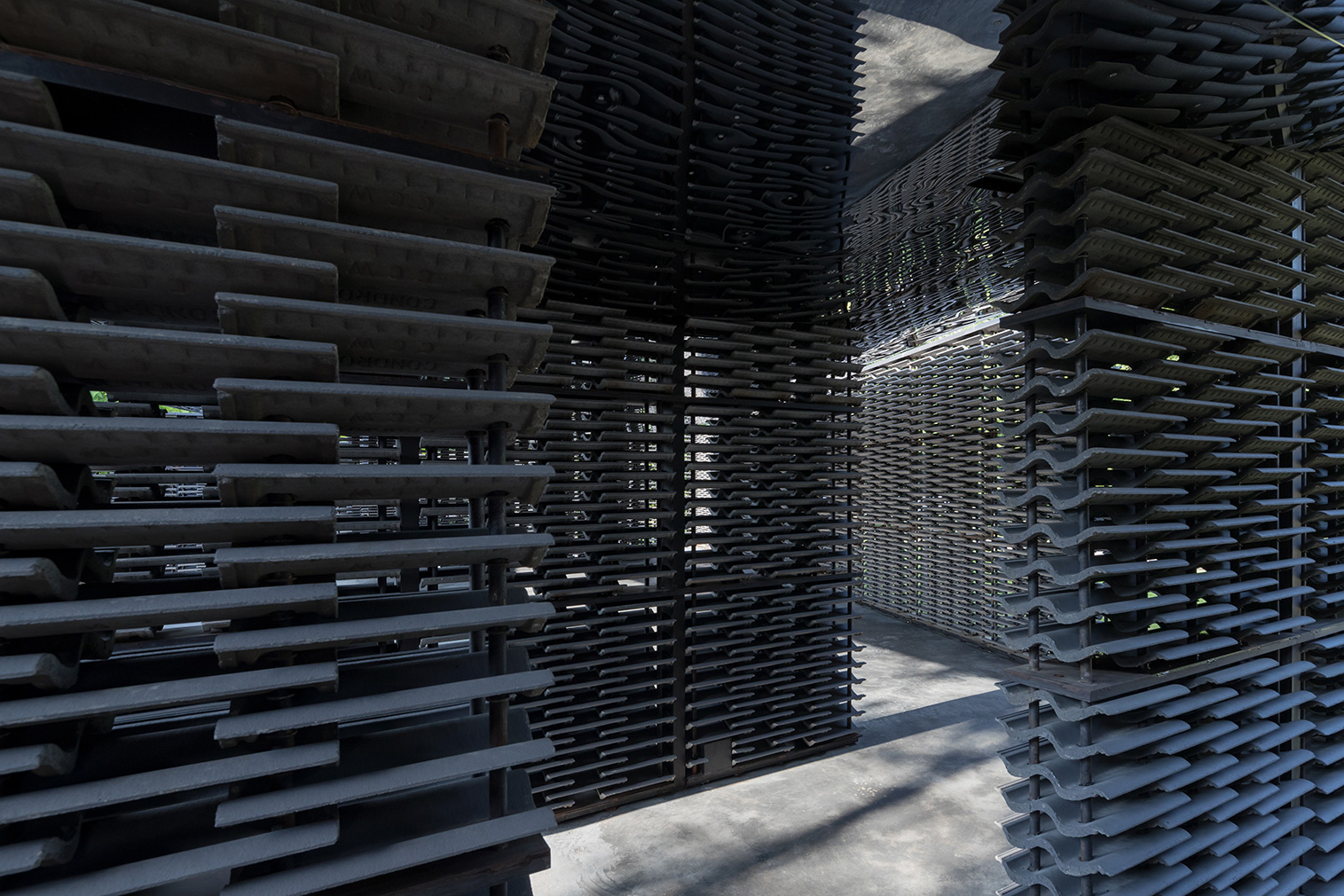
Some past pavilions have suffered from materials that restrict the air supply and stifle in the process. Escobedo’s perforations invite a cross breeze, making for a proper retreat, where, she says, ‘you can see [outside], but not be seen’.
Escobedo seems pleased that the completed structure is playing out as it was meant to on paper. Still, watching guests filter in and out, her eyes linger on the various components, perhaps wondering how, if, they could have been improved. Then she says, ‘You never finish designing a building.’


